insert_linkJazz Up Your Windows Desktop
Personally, I believe that the default Windows taskbar is not optimal. Fortunately for you, however, this is an issue that, to an extent, can be solved. In this article, I will highlight the taskbar customisation tricks that you can use to add a sprinkle of pizzazz to your Windows desktop.

Don’t you sometimes get bored of the suboptimal, bog-standard taskbar? If you do, you’ll likely adjust the personalisation settings: the colour, tray icons, pinned items, labels, icon size, position, and so on.
Rather inconveniently, Windows does not offer boggling quantities of taskbar customisation built-in. It’s not like you can easily adjust the transparency of the taskbar, for example.
Equally, some taskbar customisation options compromise other features. An example of this would be using small taskbar buttons. This, in Windows 10, disallows the use of badges—such as the one on your Windows 10 Mail app showing how many unread items there are in your inbox.
For this reason, I feel that Windows is considerably limited in its customisability. By contrast, Linux provides you with far more control over how your desktop acts, looks, and feels. Disappointment—no?
In spite of Microsoft’s limitations, though, there are useful things you can do with your Windows desktop. Furthermore, third-parties decided to join in on the fun by providing us with tools to expand Windows; we are hence blessed with taskbar customisation options not available before.
These are the 5 taskbar customisation tricks that you can employ to enhance your experience and potentially increase productivity.
insert_link1: It’s Time to Embrace the Vertical Taskbar
It’s fairly rare to see a vertical Windows

taskbar because everybody sticks with the default. In actuality, that’s a massive shame, given that they are missing out on some good stuff. You might, in fact, be fooled into thinking that the vertical taskbar is, in practice, absolutely terrible.
I like to save space on my screen—for maximum real estate—thus you would have thought that a vertical taskbar is a no-brainer. This is considering that most screens nowadays are of a wide aspect ratio; surely it would use less space on the shorter side of the monitor assuming the taskbar is of an equal width.
Why would this be terrible?
It turns out that when docked to the side, the taskbar is thicker than when horizontal. To add to this, you aren’t able to reduce the taskbar’s width—even when using small taskbar buttons.
While this does save space (about 15% for a 16:9 screen), the difference is not considerable. Evidently, Microsoft focuses their energy on the horizontal taskbar at the bottom of the screen. If only one could choose to have a shortened date (DD/MM) permitting a compact taskbar size.
But shouldn’t you just use autohide?
Well… I’ve learned that it can be exceedingly annoying: you reach for the window title bar, that button on the bottom of your window, or the scroll bar and boom—the taskbar’s come to say hello.
My ideal feature for ultimate taskbar customisation would be the ability to disable the taskbar altogether unless accessed by a keyboard shortcut—or even autohide except you click the edge of your screen to view it. NO—even better—the taskbar shows only when you apply sufficient pressure to the edge of the screen. Some Linux docks do this.
insert_linkHere is The Solution to All Vertical Taskbar Problems
Before I learned about this taskbar customisation trick, I saw no reason to use the vertical taskbar over the horizontal counterpart. Now, conversely, the vertical taskbar is my first and only friend.
The grand solution to all your problems is combining the above two problems, strategically.
“U wot m8”
Here’s how the rhythm rolls:
1. Enable autohide. This is ultimately how we are going to achieve the maximum screen real estate possible on a Windows desktop.
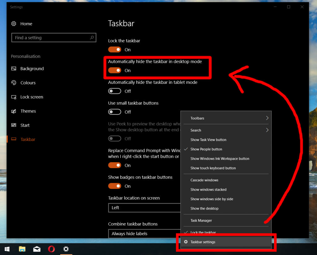
2. Dock the taskbar to the left of the screen. As a result of doing this, the number of unsolicited taskbar appearances will be reduced; there are no scroll bars, title bars, or many buttons that attract your cursor like a cowboy drawing in his prey.
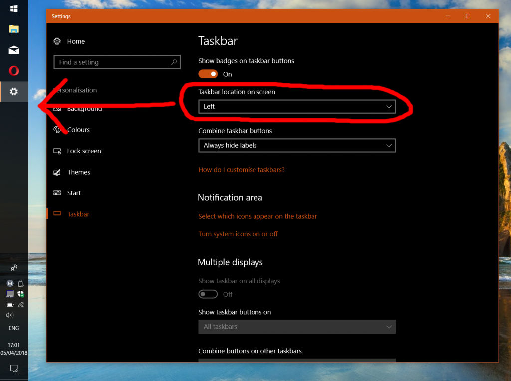
3. Combine the taskbar buttons when it is full. Immediately, you should not see a major difference in the taskbar. This is due to the absence of space for the application titles.
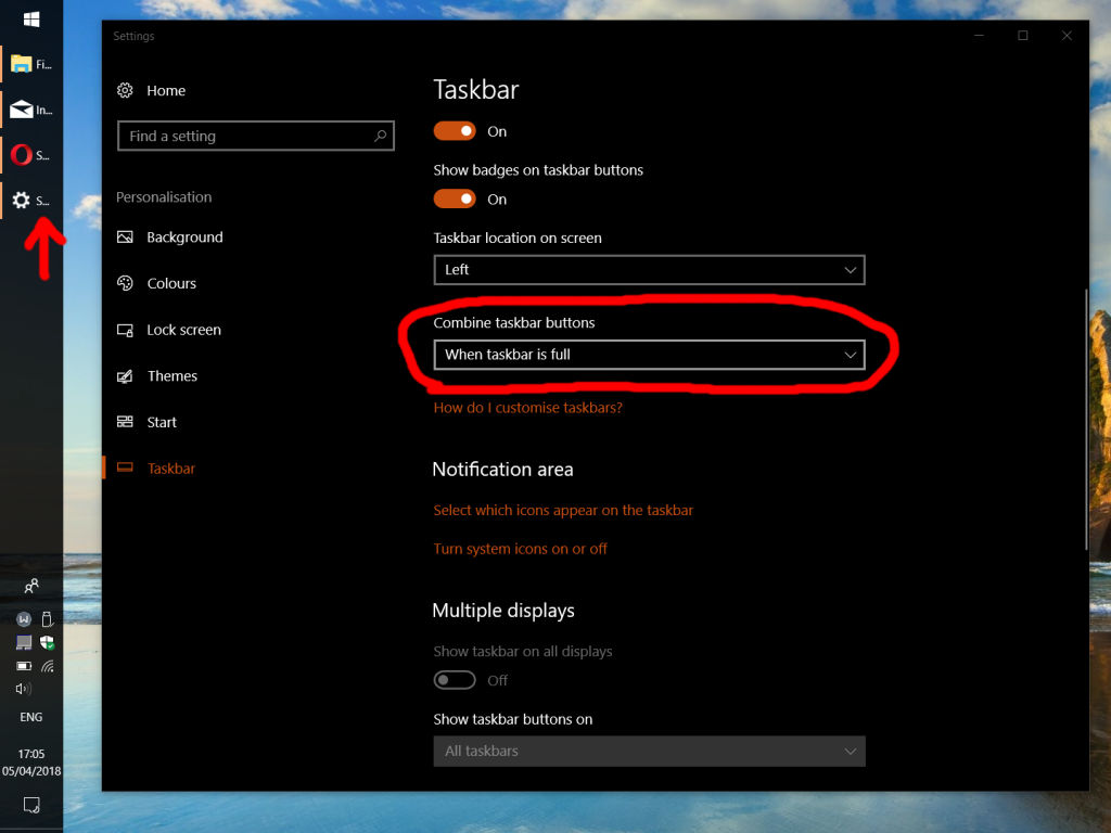
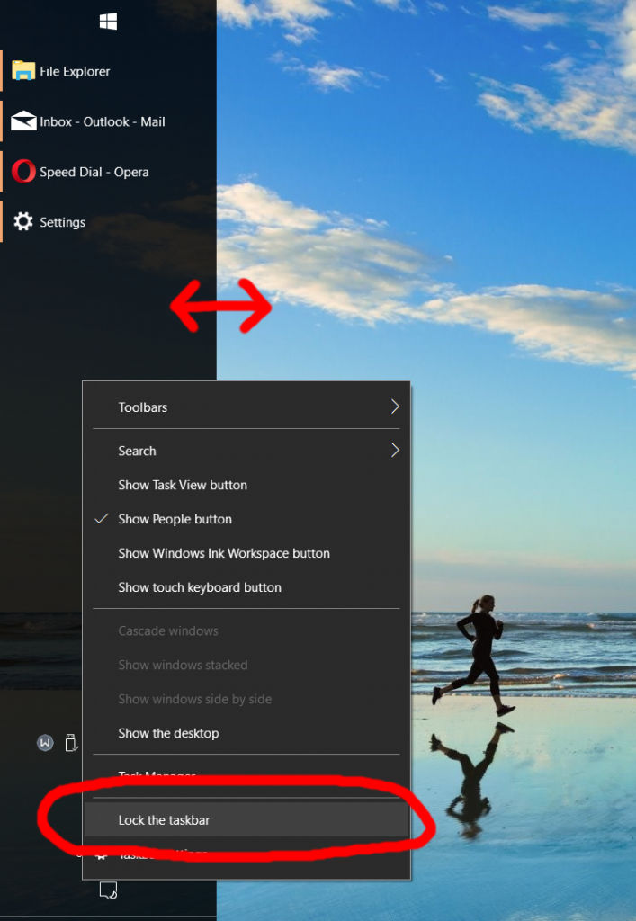
4. Temporarily unlock the taskbar and expand it (like you would a window). You should now be able to view the application titles. The spectacular aspect of this is that you aren’t sacrificing additional screen space, meanwhile, you are expanding the informational capacity of your taskbar.
5. (Optional) Make the Start menu full-screen. In my opinion, this looks much better with the tiles using this taskbar style. On the other hand, if you have no pinned tiles (solely the app list) this may not make sense.
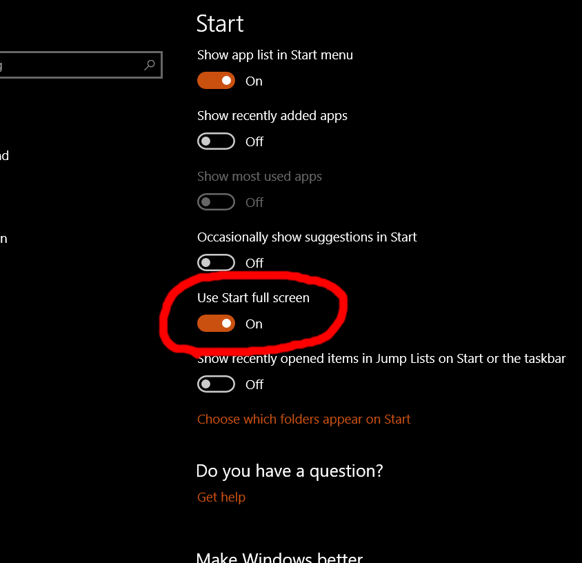
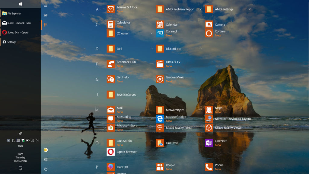
As a result of these five steps, you can enjoy a list of applications with their labels and screen space. On a final note, I use Task view (WIN+TAB) and ALT-TAB to switch windows without having to show the taskbar. Make your taskbar buttons small, too, if you ever need more taskbar space.
insert_link2: Save Even More Space and Tweak Your Taskbar Further
What if you want even more taskbar customisation options? Ah, never fear, since 7+ Taskbar Tweaker is here to rescue your paranoid face. Although the programme is capable of many taskbar customisation features, here are my highlights of the application:
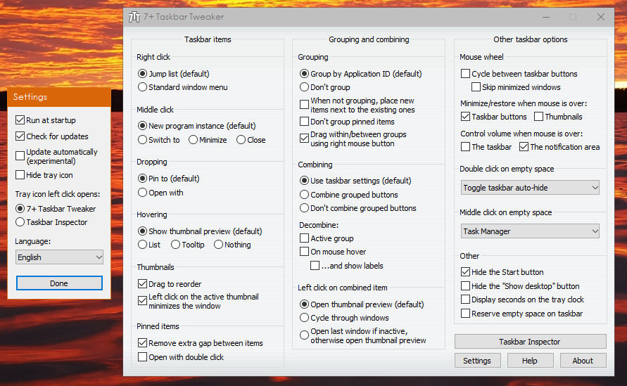
- Hide the Start button.
- Reorder thumbnails
- Hide the desktop preview button.
- Customise the grouping and combining behaviour of the taskbar.
- Easily toggle the taskbar auto-hide function by middle-clicking or double-clicking, which could be immensely useful.
- Customise clicking behaviour of the taskbar.
- Also, display seconds on the taskbar clock.
- Finally, other options include configuring scroll behaviour of various parts of the taskbar.
If you're someone wanting to squeeze the most out of your taskbar, you'll really appreciate this application; it empowers you to customise the taskbar precisely like how you want it.
However, this application primarily configures the taskbar's behaviour rather than appearance. I'd recommend fiddling around with the application, so you can benefit from maximum productivity.
The application, for the most part, is rather straightforward; all settings in the main 7+ Taskbar Tweaker are conveniently categorised as well as sufficiently self-explanatory. Moreover, it comes with a tray icon where you can quickly access all areas of the applications.
You can disable the tray icon, though, if you don’t regularly use it. For example, you might only want to use the “Taskbar Inspector,” which we discuss later. You’re allowed to configure a double- or middle-click of the taskbar to open said Taskbar Inspector, eliminating the need for the tray icon.
insert_linkEnjoy Easy Auto-Hide of Your Taskbar
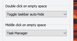
I must say that being able to auto-hide the taskbar by merely double- or middle-clicking is a life-saver—no less. This is especially true if you followed the steps in Trick 1. To clarify, a thick, vertical taskbar that doesn’t auto-hide consumes a considerable amount of screen real estate.
As outlined earlier, you could auto-hide the taskbar in order to resolve this problem. But, you might not like that—at least, not all of the time. After all, many applications don’t fully use the wideness of our widescreen monitors meaning there is not much to lose.
Sometimes, on the other hand, maximum screen real estate is essential. Therefore, this feature of 7+ Taskbar Tweaker enables you to instantly increase your screen space.
insert_linkTake Advantage of Intense Taskbar Customisation of Icons
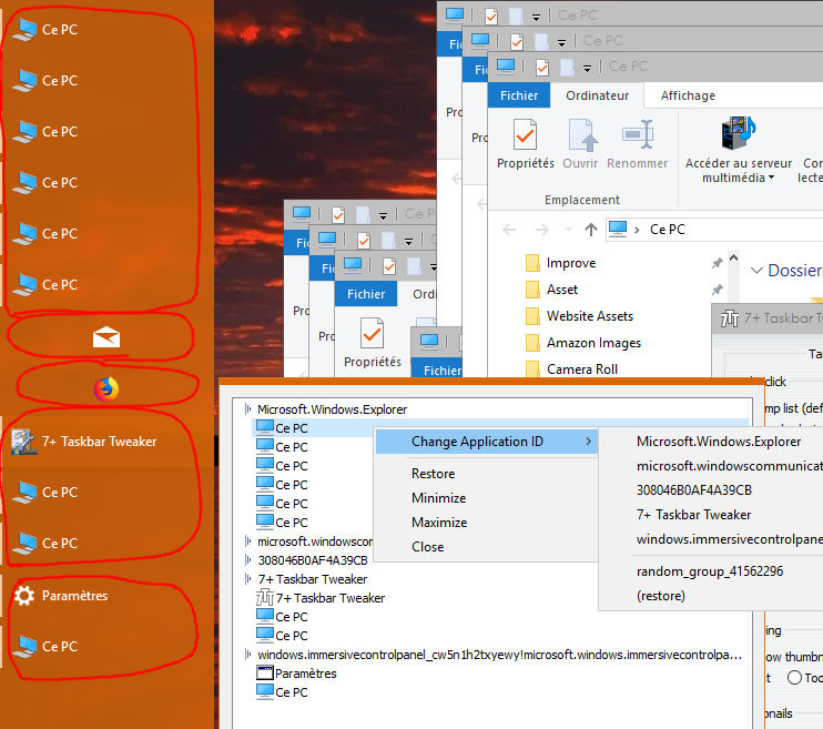
What’s more, you can use the “Taskbar Inspector” to customise each application individually. This feature can be accessed from the tray icon or the main interface. Upon opening, you will see a list of all of your items currently in the taskbar.
Next, secondary-click any of your taskbar items with a blue triangular symbol to the left—these are the application IDs under which running applications can appear in a group. You will now be able to access four options: show label, group, group pinned item, and combine. Furthermore, you can decide whether the item do or don’t do each.
If you click on the running applications, on the other hand, you can change the window state and change the application ID it comes under.
One use case might involve having all the taskbar icons with their labels hidden; you are very conservative with the horizontal taskbar space. Although, with your browser, you have difficulty identifying which window has what webpage. As a result, you use “Taskbar Inspector” to always show the label for your browser.
Additionally, any changes you make will be retained.
insert_linkTaskbar Weight Loss Programme: Make it Super Thin

If you weren't convinced of my super-wide taskbar in Trick one, 7+ Taskbar Tweaker can help you. Remember how I said you could only make your vertical taskbar so small? This application can break that limitation once and for all...
In order to take advantage of this benefit, secondary-click the tray icon and proceed to "Advanced settings." Next, scroll down the materialised windows to find "nowidthlimit." Double-click the 0 over to the right and change that to 1.
Since I've found this does not work instantly, you might have to sign out and sign back into your account. Now, if your taskbar is not locked, you will be able to shrink it quite nicely. You can also use small taskbar buttons to make your taskbar even thinner.
This sweet sub-trick opens up the possibility of easily switching between a wide, auto-hide taskbar and a super-thin, always shown taskbar—assuming you have your taskbar unlocked at all times and are using double- or middle-click to toggle auto-hide.
insert_link3: All-Around Added Control Over Windows
Next up: Winaero Tweaker. With this application, you are given a multitude of different options to configure your Windows experience. Hence, this can be an extremely useful addition to your collection.
Important note—do not click the link of “fixing Windows errors and optimising system performance.”
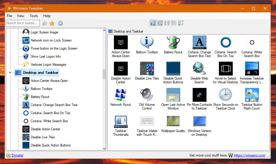
Having said that, where does it help with taskbar customisation? In fact, there are a few options concerning the taskbar—most are found under the “Desktop and Taskbar” section. While some are covered already in the 7+ Taskbar Tweaker, most options aren’t available in the aforementioned application.
For example, you can show up to ten contacts on the taskbar instead of the typical three. Of course, this is not so useful if you don't use this feature.
You can also make the action centre stay open when you click away. Instead, you will need to close the pane manually.
Cortana joins in on the taskbar customisation party: you can customise the search box text, move the text box to the top of the search pane, and give it a white background colour. Also, the web search can be disabled.
Moreover, you can fully disable the action centre. This removes the taskbar icon, shortcut, and even disables its notifications. If you don’t want to go that far, though, you can also disable the quick action buttons at the bottom of the pane.
In appearance, a more transparent, glassy taskbar could be used and you’re able to customise the system font. Thumbnails, additionally, can be thoroughly customised in accordance with your desires.
Other non-taskbar-customisation related features include modifying the appearance of windows, privacy settings, and much more.
insert_link4: The Contents of Your Taskbar Matter
Now, it is time to evaluate the productivity value of your taskbar's contents. Indeed, we will be using the old tricks in the book of general Windows knowledge.
Let's begin with the search and task view buttons. Secondary-clicking on the taskbar allows you to show or hide these icons or—in the case of the search—you have the option to make it a text box, in addition to an icon or hidden.
In my case, I have both icons hidden, merely because there are quicker ways of using the functions:
Search: open the Start menu and start typing to search, despite the absence of a text box.
Task view: press WIN+TAB or CTRL+WIN+LEFT/RIGHT ARROW to change virtual desktops. Also, you can use CTRL+WIN+F4 to close a virtual desktop and CTRL+WIN+D to create a new one.
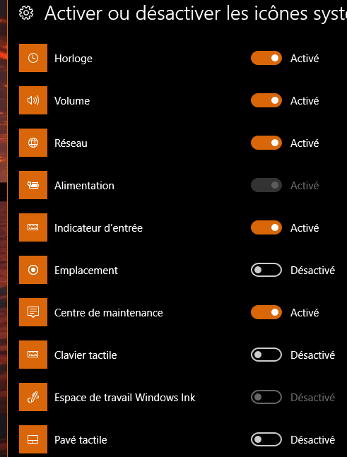
Furthermore, you can hide certain tray icons to save space on your taskbar to focus on the ones you use. To do this, secondary-click the taskbar, go to the taskbar settings and look at the options under "Notification Area." Next, using the two below links, you can show/hide tray icons and, if you so wish, system icons such as the volume, clock, and action centre.
Alternatively, you could simply drag icons to and from the overflow menu to prevent visiting the settings.
Tray icons that you don't use frequently you could hide. But if you use Trick 1, you have plenty of horizontal space that you may feel inclined to use up. One technique you could use if appearance is your jam: only show the system icons, which have the clean, white aesthetic.
insert_linkExpand the Taskbar Functionality with Toolbars
I don't like toolbars, though your opinion may differ. To show or hide the toolbars, secondary-click the taskbar and go to "Toolbars." Whereas "Desktop" and "Links" add buttons that show a list, "Address" shows a text box.

These could be immensely useful for your productivity if you use them. For example, you could keep your frequently used websites in the Links toolbar. Also, you can use the Address bar to quickly access a website or folder directory.
As you can see, Microsoft isn't exactly investing heavily in these toolbars.
insert_linkOther Basic Features You Need to Use Correctly
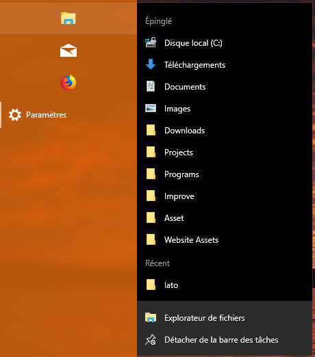
In addition, usage of jump lists can increase your productivity. For example, when secondary-clicking on an Internet browser might show options to open a new tab, new window, or a private browsing option. File explorer, too, shows its quick access and recent items.
Moreover, you can pin items to your icons, such as a document to Word. In order to achieve this, drag the file onto the taskbar icon. So, when you secondary-click said icon, you see the pinned file in all its beauty.
Another bonus tip is the hidden menu when you secondary-click the Start button or press WIN+X. Here, you can quickly access functions like Settings and File Explorer, as well as admin functions such as command prompt and disk management. Not so much of a secret now!
You've now had a fun taskbar customisation session. Therefore, you can now be more productive and empowered to do great things.
Customise More: Ultimate Checklist for the Best Initial Windows 10 Setup 2018
For more computer proficiency tips and trix, subscribe to email updates.
And buy some butter to make sure your supply will never run out.
Also, if you can't have enough quality applications, see the resources page.


